
Data reporting with Charts in Excel
November 18, 2022 2024-01-04 2:53Data reporting with Charts in Excel
Data reporting with Charts in Excel
A chart is a visual depiction of a set of tabular facts. Charts for data visualization can be added once you’ve decided on the data you want to include in your report. The data in the graphic corresponds to the data listed in the report’s table.
Excel charts are great for assisting in data analysis by highlighting one or more components of a report.
Some basic and advanced charts used for data reporting in Excel includes bar charts, pie charts, scatter graphs, histogram etc.
The steps are simple to follow:
- Select the data range.
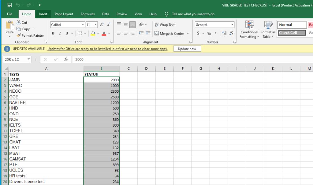
- Click Insert > (choose desired chart type from icons).

- Customize inserted chart as needed.